On the mobile team, we strive to produce web apps which look and feel just like installed apps. In the past few weeks, we’ve released a number of features which make Gmail for mobile look sharper and feel smoother.
Pull down to refresh
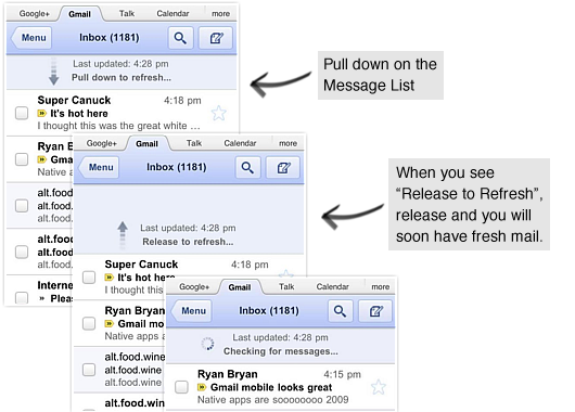
You can now pull down to refresh your message list and conversation on all iOS and Playbook devices. To refresh, simply touch the message list, drag downwards and release.

High resolution icons
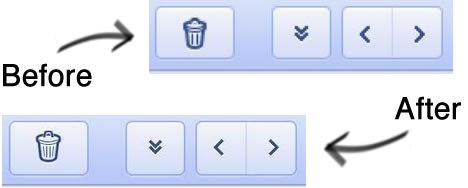
For those of you using Gmail for mobile on an iPhone 4 Retina display, the icons and graphics are now at a higher resolution, making Gmail for mobile sharper.

Transitions
When you tap on a conversation, tap back to the inbox, go to the menu or go back, the view will slide left or right. This new transition animation is a quick, small indication that makes the view change feel smoother.
Curious web designers often ask us how we implement certain features. In this case, we used a combination of up to eight different CSS3 transitions and Javascript to get things to look just right.
As always, go to mail.google.com on your mobile browser to check out the latest updates to Gmail for mobile.
Pull down to refresh
You can now pull down to refresh your message list and conversation on all iOS and Playbook devices. To refresh, simply touch the message list, drag downwards and release.

High resolution icons
For those of you using Gmail for mobile on an iPhone 4 Retina display, the icons and graphics are now at a higher resolution, making Gmail for mobile sharper.

Transitions
When you tap on a conversation, tap back to the inbox, go to the menu or go back, the view will slide left or right. This new transition animation is a quick, small indication that makes the view change feel smoother.
Curious web designers often ask us how we implement certain features. In this case, we used a combination of up to eight different CSS3 transitions and Javascript to get things to look just right.
As always, go to mail.google.com on your mobile browser to check out the latest updates to Gmail for mobile.

0Awesome Comments!